After being shortlisted in nine categories for the 2019 Transform Awards APAC, we are extremely proud to announce that we have walked away with a total of EIGHT, including the ‘Best overall visual identity’ for the second year in a row!
We headed to the W Hotel on November 27 to mingle with some of Asia’s top agencies and battle it out for the top gongs. There was a 70% increase in entries this year putting us up against some tough competition. We couldn’t be happier to have continued our success during our second year at the Awards.
The Transform Awards celebrates its sixth year in the APAC region but was held in Shanghai for the first time, after five years in Hong Kong. It is the only awards programme awarding the best brand work in the region, recognising best practice in corporate, product, and global brand development work with categories that focus on strategy, execution, content, and evaluation.
Congratulations to our team for their amazing work, and thank you to our clients for offering us the opportunity to do what we do best!
SHARE
The best of the best
For the second year, JWDK took home the prize of the ‘Best overall visual identity’ for our project Bridgelife with Kicers Shanghai. This category cannot be entered and is selected from all entries across different sectors, based on all visual aspects of the branding, from the logo to the typeface.
Judges “loved the combination of nods o the area’s heritage with a modern, urban identity,” and commented that “the result is a digitally integrated, colourful, young, transparent brand.”
Going for gold with Bridgelife & Kicers
GOLD: Best place or nation brand
GOLD: Best visual identity from the property, construction and facilities management sector
BRONZE: Best wayfinding or signage
Set in the heart of Baoshan, Shanghai, the Bridgelife project is 70,000 sqm former vacuum-flask factory turned social destination for sports, food, education and cultural activities. In order to better understand the need of the local residents and bring relevance to the project, we conducted a series of workshops with those living within the area.
We delivered a powerful colour temperature system that would trigger different moods and help to guide visitors around the maze-like layout of the site, while our chosen name brings together the surrounding neighbourhoods and connects them to the brand.
Winning with World Cities Day
GOLD: Best visual identity from the public sector
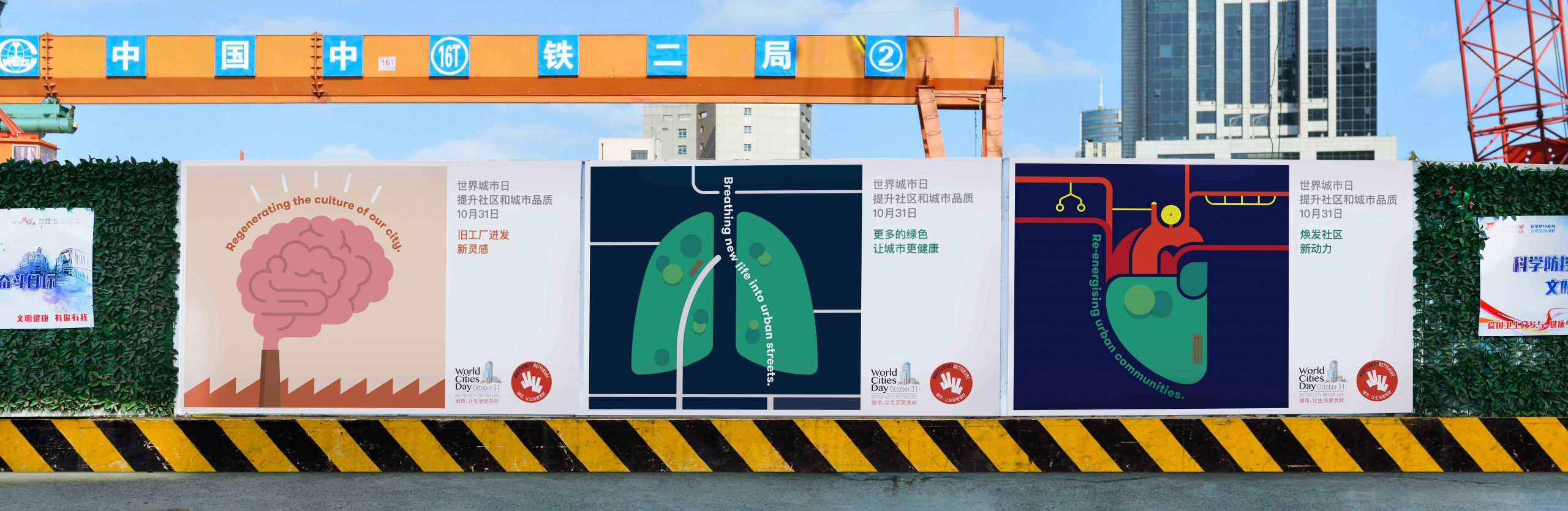
World Cities Day, held annually on October 31, is a global initiative from UN-Habitat and Shanghai’s Ministry of House and Urban-Rural Development aimed at encouraging interest in sustainable urbanisation and providing solutions to the challenges it brings.
The judges were impressed with our campaign to encourage participation from the Shanghai public via social media by using our ‘W’ symbol, calling it “personable and clear”. The icon was featured across all marketing collateral with the aim of raise awareness and allow people to make small changes in their lives that could help the city more liveable.
Stars for Lumina & Henderson Land
SILVER: Best place or nation brand
Highly Commended: Best visual identity from the property, construction and facilities management sector
Lumina is Henderson Land’s first foray into the mainland China market. The series of lifestyle-focused commercial developments in Shanghai and Guangzhou will house Grade A offices, state-of-the-art entertainment space as well as retail.
The visual identity centres around the start shape logo which represents the five core principles that differentiate the development from its competitors. The Picasso-style eye brings a feeling of warmth and curiosity to the brand.
Super results for M-Place & PAG/China Merchants Group
Highly Commended: Best visual identity from the retail sector
The former China Merchants Plaza was in desperate need of a facelift for its retail podium and office interior. We were invited to develop a new brand that would inspire fresh new brands and businesses to join.
We worked together with PAG and China Merchants Group to create a brand solution that added a major burst of energy, allowing this dark corner to come alive with a fresh new ‘super-hero’ look and entice a younger generation of entrepreneurs and professionals to the retail podium.
TAGGED:
Predictions on the future of Chinese typography
19 January 2021
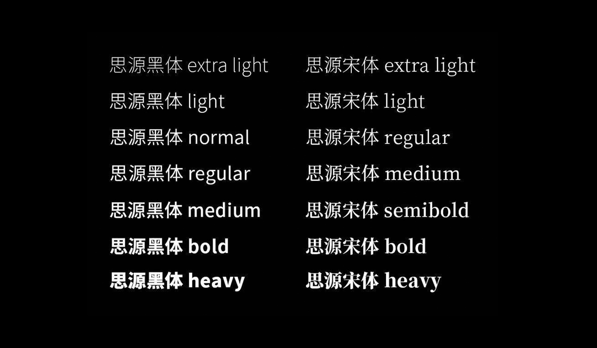
Over the past few months, JWDK has been researching Chinese typography and character design. Read below for a round-up of our findings.
JWDK launches campaign for World Cities Day 2020!
6 November 2020
For World Cities Day 2020, JWDK continues to work with local government to deliver the message of this initiative.