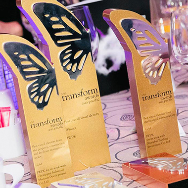
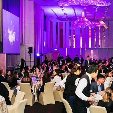
JWDK has won 2 Golds, 1 Silver, 1 Bronze trophies, as well as Best Overall Visual Identity award, at the fifth annual Transform Awards Asia Pacific. JWDK’s excellence in rebranding and brand development was recognised in a room brimming with industry specialists.
Established in 2009, the Transform Awards has evolved into a celebration of the indispensable talent that exists within the branding sphere. Covering Asia-Pacific, the Middle East, North America and Europe, the Transform brand itself is truly global, with no other outlet as committed to providing such comprehensive coverage of the brand environment.
“This year, the calibre of submission has been phenomenal, and the clients and agencies that have won have demonstrated outstanding creative ability and strategic insight,” said Andrew Thomas, publishing editor at Transform magazine.
SHARE
Overall best prize
JWDK’s Boomtown project won ‘Best Overall Visual Identity’ in the Asia Pacific for 2018. The judges were mightily impressed and commented;
“Definitely unexpected.”
“A slice of urban utilitarianism with functional design inspires and works in equal measure.”
“The images look hip and modern, yet reflective of the steel industry past.”
According to the judges, it the brand’s ability embrace the past while preparing for the future that propelled it into the premier award category.
Golden dream for Boomtown
Gold: Best Visual Identity from the Property, Construction and FM sector
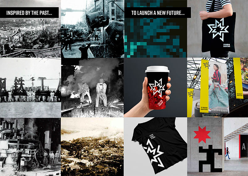
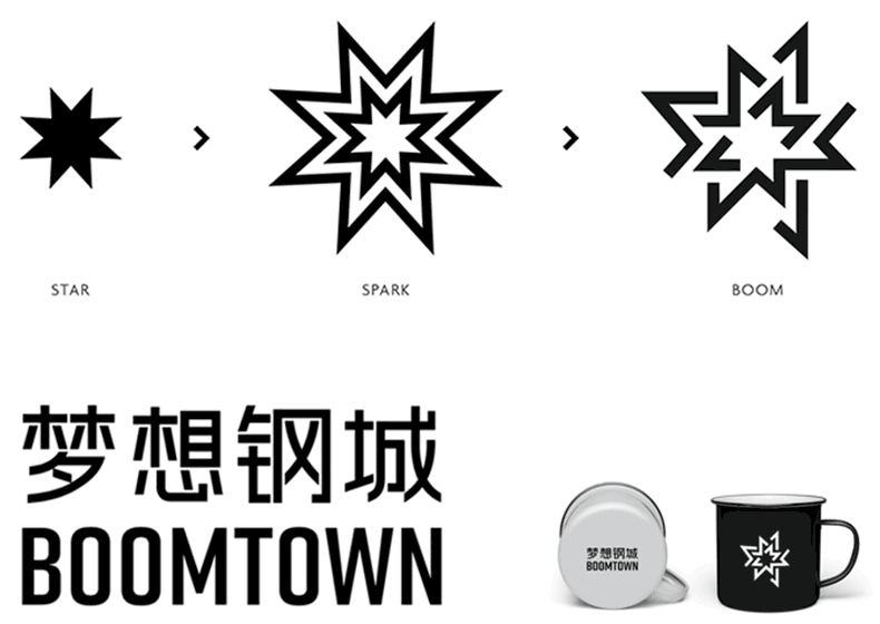
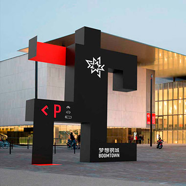
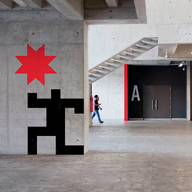
Once a thriving community of workers and families, the Chongqing Iron and Steel Factory was the largest manufacturing plant of its kind in China. Today, the factory enters a new phase of dreams and innovation relaunching as a steel museum, workspace, theatre, hotel, and lifestyle centre. JWDK named the site 梦想钢城 (Meng Xiang Gang Cheng) – meaning ‘Steel City of Dreams’ and this vision is expressed in the logo design which contains a guiding star at its heart surrounded by shapes portraying an industrial spark.
The identity expands into a series of zones and sub-brands including the logo for the steel museum which is represented by the mascot ‘Gango’ (similar to ‘gang ge’ in Chinese meaning ‘steel brother’). He stands as a steel warrior guarding the site in honour of the factory workers who stayed to protect the factory during wartime.
JWDK demonstrated strength in strategic positioning as well as excellence in design delivery including way-finding systems. Read more about this project.
Turning bronze into gold for Baoding
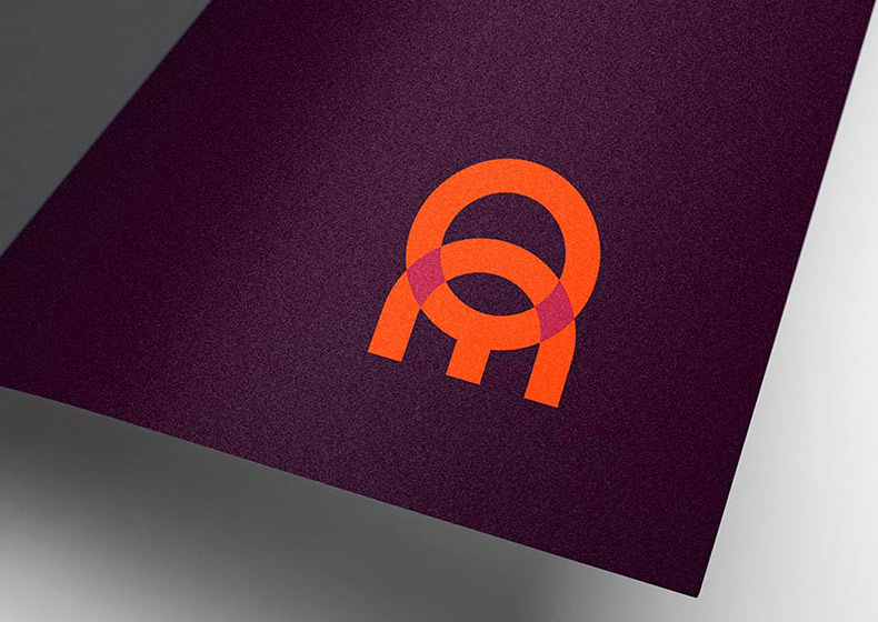
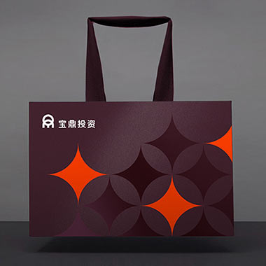
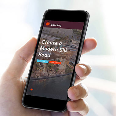
Gold: Best Visual Identity from the Financial sector
JWDK worked with the senior management of Baoding to uncover the values of the firm and its future direction. The new brand identity is based on the shape of the ‘ding’ (traditional Chinese three-legged cauldron) and highlights its significance to the firm and name. ‘Ding’ represents power, strength, stability, and reliability, traditionally made from bronze, the logo also uses a warm colour palette. The visual identity system was produced in two languages and contained a distinctive pattern used across all applications. Read more about this project.
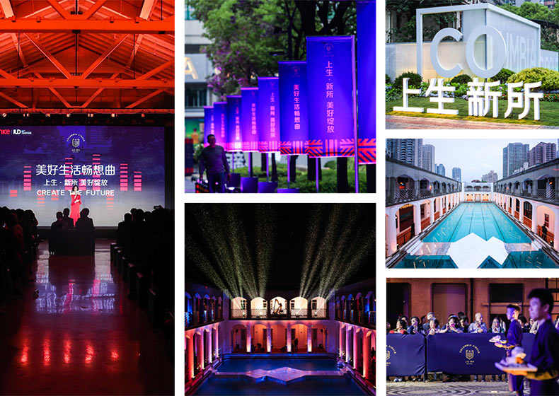
Silvery star for Columbia Circle
Silver: Best Visual Identity from the Property, Construction and FM sector
JWDK also clinched silver in this category with the famous Columbia Circle project, Shanghai’s newest hip location. Columbia Circle is an important historical site designed and built in the 1920s for the American elite society in Shanghai. Now, under the steam of property giant Vanke, Columbia Circle will once again welcome a buzzing social community for all in Shanghai to enjoy. From entertainment and dining to sports and games, people will benefit from a diverse working environment with a super-connected social network.
JWDK’s new name and brand identity take inspiration from the former Columbia Country Club crest found on the original clubhouse fireplace. The simplified emblem features a shield of stripes and a single star shared by the American past and its Chinese future. Judges were impressed and commented;
“The brand identity speaks for the future and history of this historical building.”
Read more about this project.
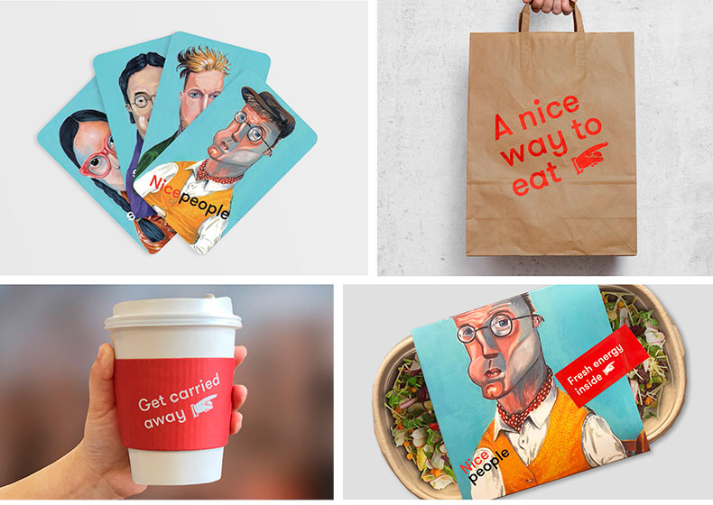
Nicepeople, nice trophy
Bronze: Best Visual Identity from the Food and Beverage sector
Nicepeople is a new brand of bar and dining room located in Huangpu district, Shanghai and grew out of a need to better connect the surrounding creative community. With over 150 creative firms in the local area, Nicepeople has relaunched as a platform for social events, dining, meetings, art launch parties, and workshops. The new brand aims to bring creative people together over food and help to boost their business too. Comments include;
“The design is bold and memorable.”
“Love the co-creation aspect with customers. Great example of knowing your customer and responding with a visual identity that fully meets the outcomes sought.”
Read more about this project.
This was the first time JWDK entered into the Transform Awards Asia Pacific awards and they’re immensely proud of the results. The team looks forward to entering further international awards fuelling a new ‘created in China’ generation.
Follow JWDK on Wechat or Instagram @JWDKpartners for more award-winning work.
TAGGED:
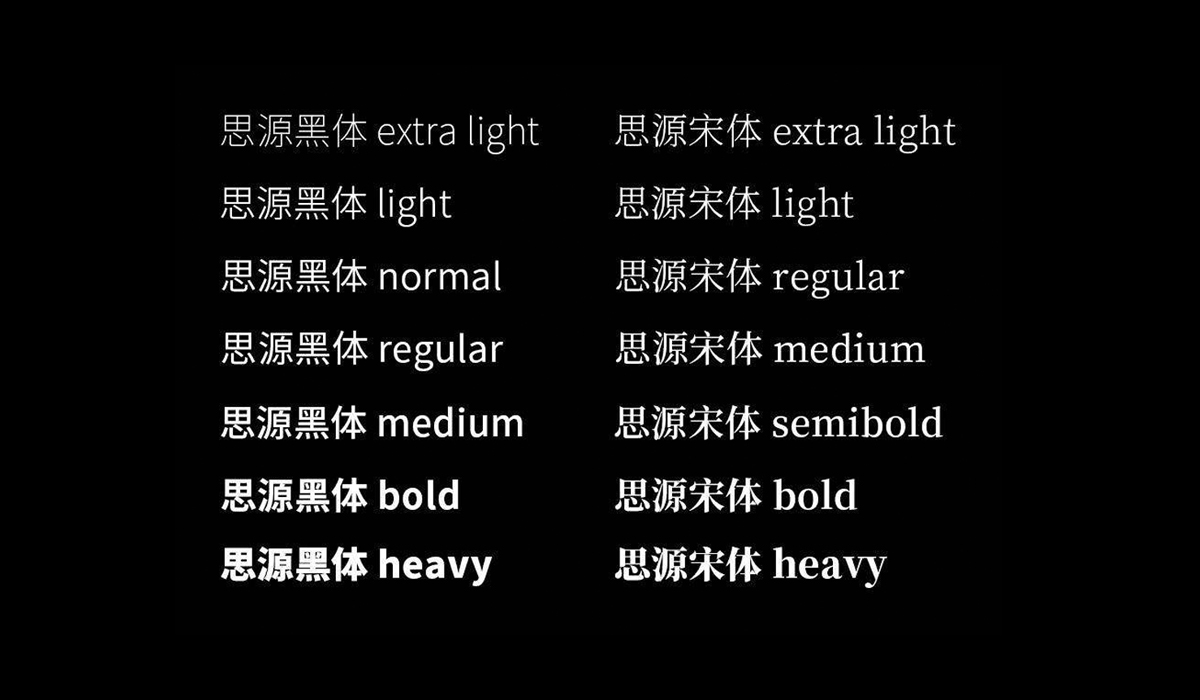
Predictions on the future of Chinese typography
19 January 2021
Over the past few months, JWDK has been researching Chinese typography and character design. Read below for a round-up of our findings.
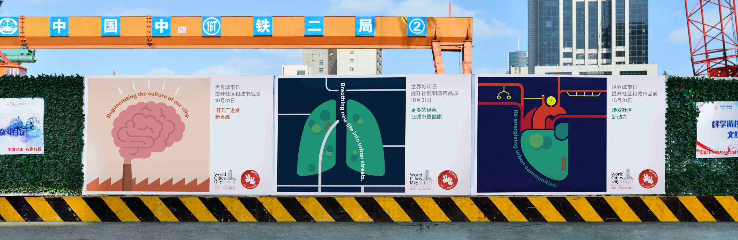
JWDK launches campaign for World Cities Day 2020!
6 November 2020
For World Cities Day 2020, JWDK continues to work with local government to deliver the message of this initiative.