Hangzhou’s Xiaoshan District is home to a fast-growing community of young families who are seeking a quality lifestyle with access to international education and not too far from the inner city. Hongkong Land & Yanlord Land saw this an opportunity to develop a unique retail destination that integrates fun, education, science and sustainability in Xiaoshan, Hangzhou’s newest innovation quarter.
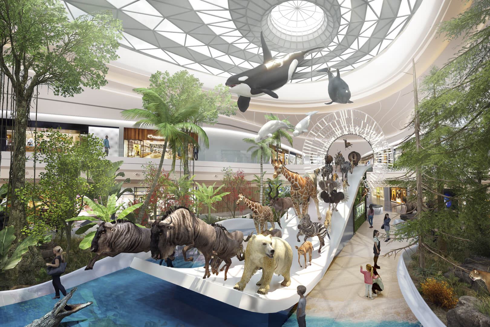
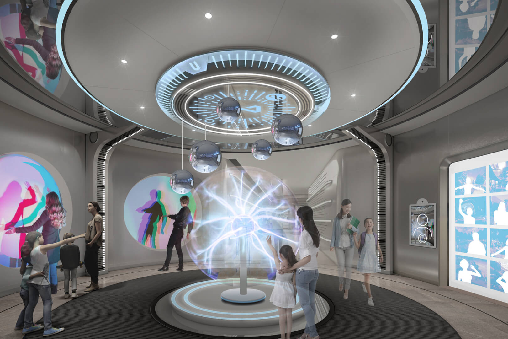
Hongkong Land invited JWDK to create a place brand for The Ring as part of a diverse portfolio of retail experiences all across China. The Ring in Hangzhou is a science-themed retail park designed to inspire curious minds and curious brands alike. Featuring four themed zones and sixteen immersive interactive experiences, The Ring brings the wonders of natural science out of the classroom and into the heart of everyday community life.
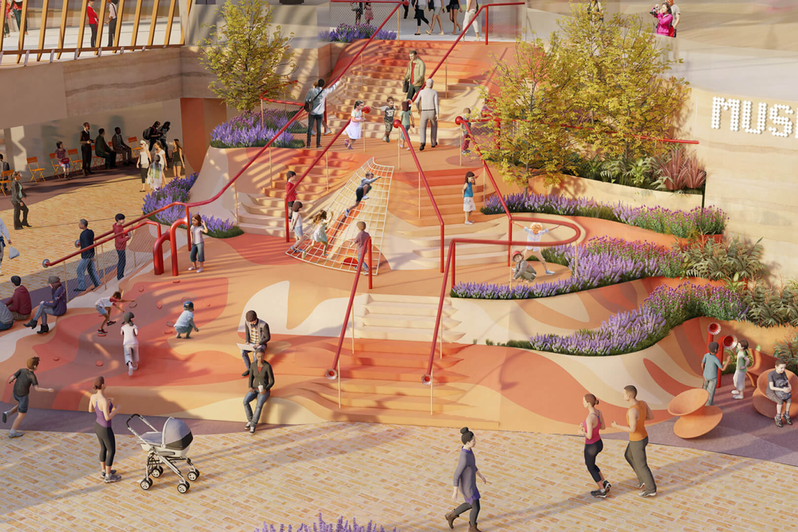
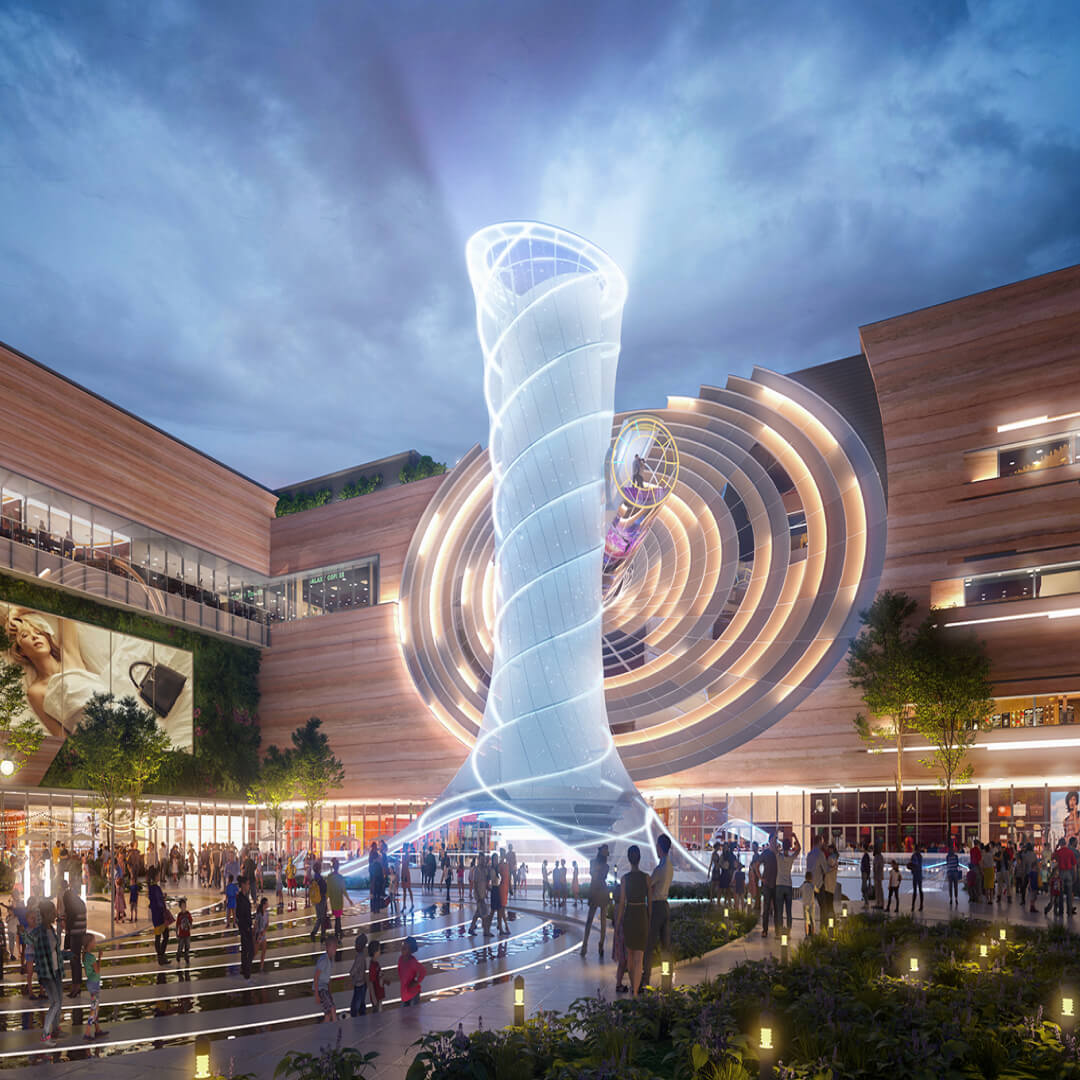 Ilustrative renders © Hongkong Land
Inclusive and educational
Our community research revealed a strong demand for highly engaging, educational experiences, particularly among millennial parents eager to take part in activities together with their children. This insight influenced the brand strategy, positioning the Ring as a place of shared discovery and connection—more than just be a mall.
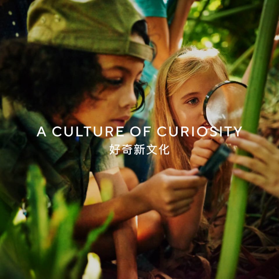
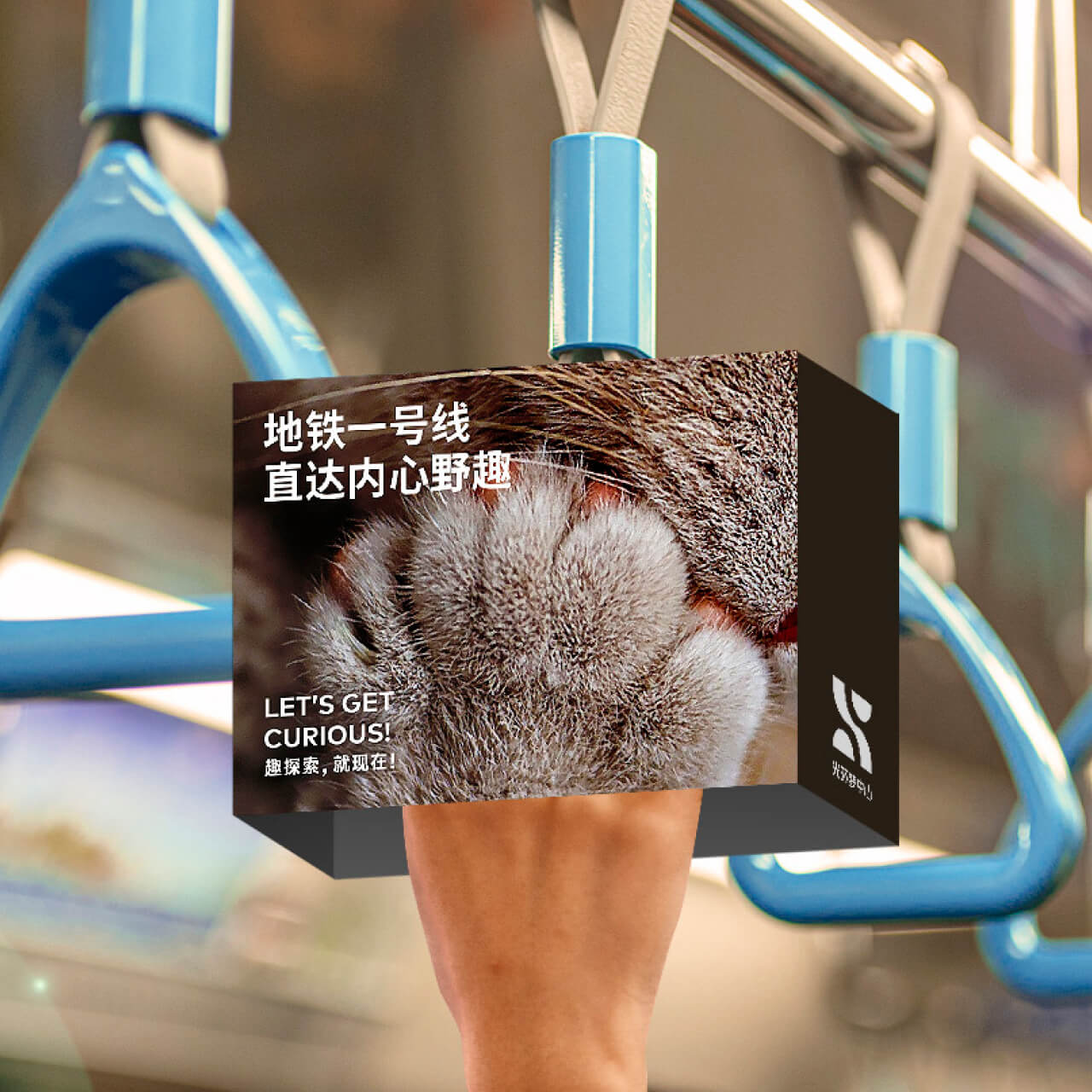
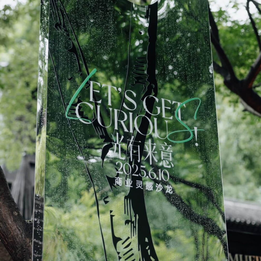
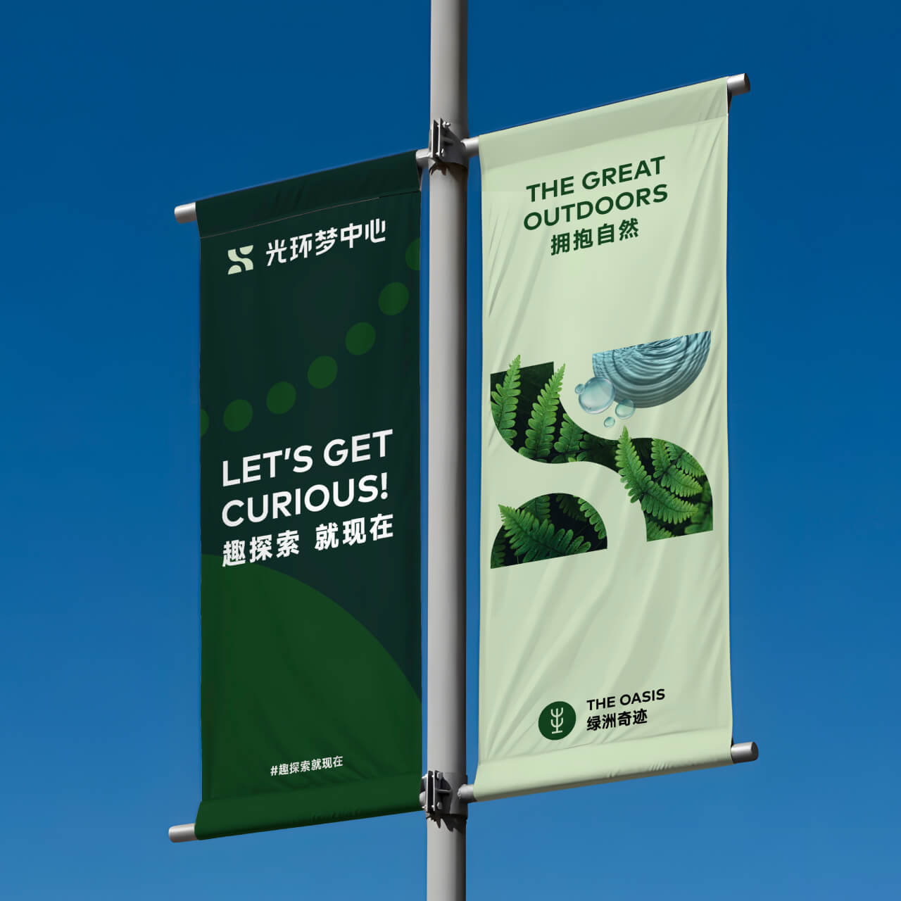
The rallying cry “Let’s Get Curious!” is the marketing slogan that invites both residents and retailers to explore, experiment and create together. It gives brand partners the licence to be innovative and playful, while encouraging families to discover science in surprising new ways.
Designed for imagination
At the centre of the brand identity is a versatile “S” super-symbol built from geometric forms and representing the four project pillars—Science,Sustainability, Social and Sensory. The flowing ribbon shape symbolises a ‘wormhole’ tunnel, guiding visitors on a journey through time and space.
Dynamic and extendable, the symbol adapts across themed zones, events and marketing campaigns, allowing the identity to evolve into a rich storytelling device. This flexibility, along with colour and imagery for each zone, empowers The Ring’s marketing team to create playful, educational content generating excitement ahead of the project’s launch in 2026.