Hang Lung Properties is a leading property developer with a premium mixed-use portfolio across Mainland China and Hong Kong. Founded in 1960, the company is best known for its flagship ‘66’ branded portfolio and its long-term commitment to quality, sustainability, community-building and placemaking. Marking its 65th anniversary in 2025, Hang Lung used this milestone year as a moment of reflection and renewal—working with JWDK to refresh its brand identity and better express its evolving ambitions.
Tracing a century of stories
Hang Lung’s vision originated from a series of pioneering projects that reshaped Hong Kong’s urban landscape. Through strategic placements in core districts such as Central, Causeway Bay, Kowloon Bay, and Mong Kok, the company has developed a portfolio of iconic mixed-use projects, establishing a strong property foothold in Hong Kong and setting benchmarks for urban development.
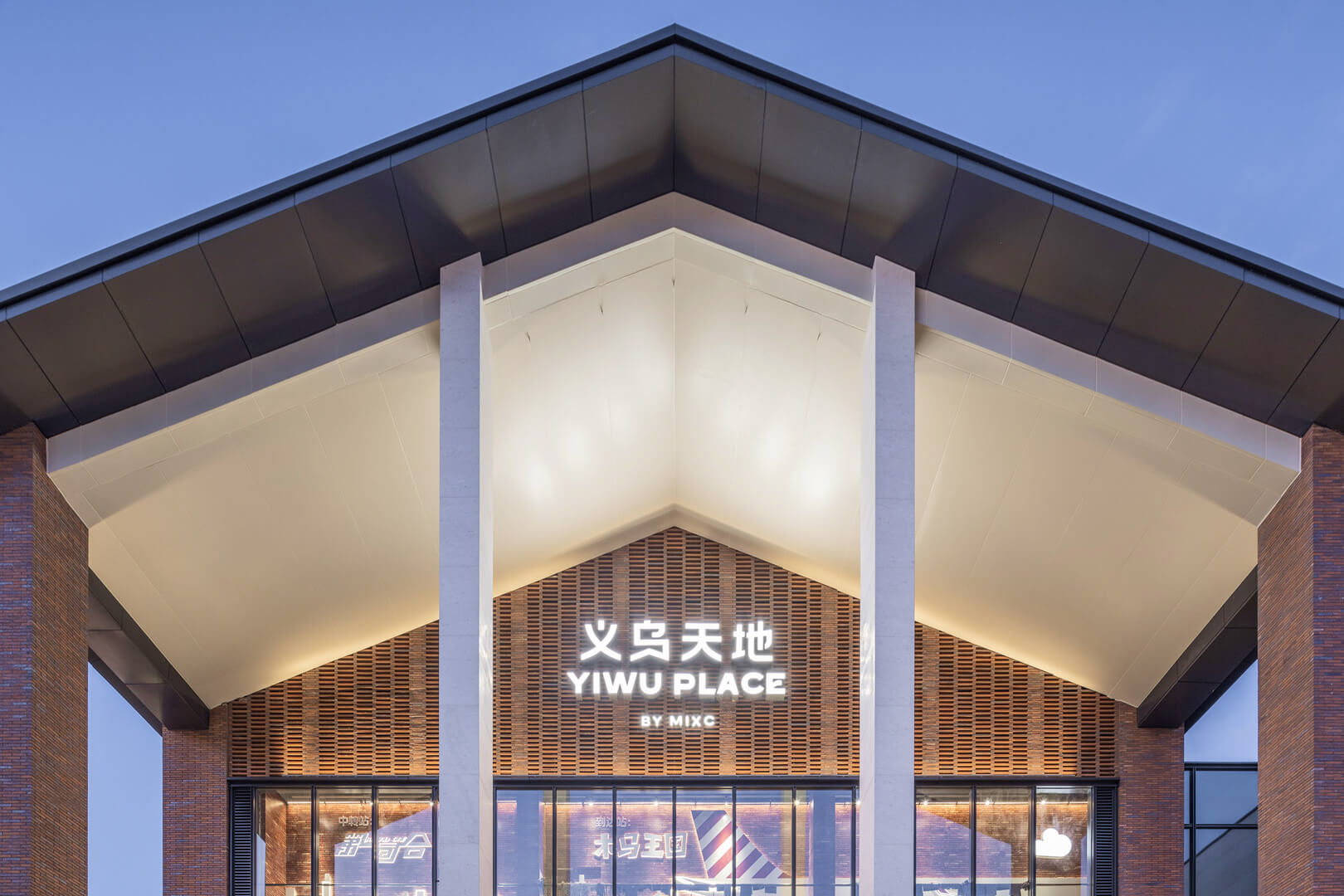
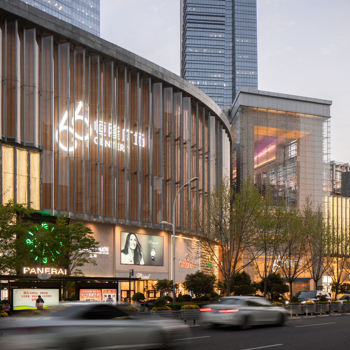
These achievements reflect Hang Lung’s vision to create compelling spaces that enrich lives, a commitment that further expanded when the company entered the Mainland market in the 1990s. Under the prestigious ’66’ brand, Hang Lung has developed 11 world-class projects across nine Mainland cities, setting exceptional industry standards for upscale retail and mixed-use developments.
Retaining its brand motto We Do It Well, Hang Lung sought to refresh its corporate brand identity to reflect its four company values—Integrity, Sustainability, Excellence, and Openness.
Crafted refinement
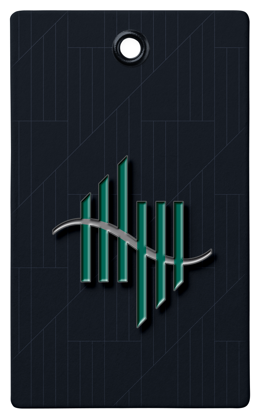
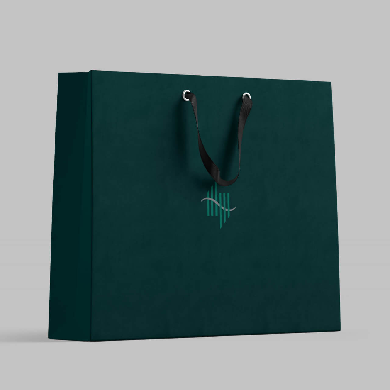
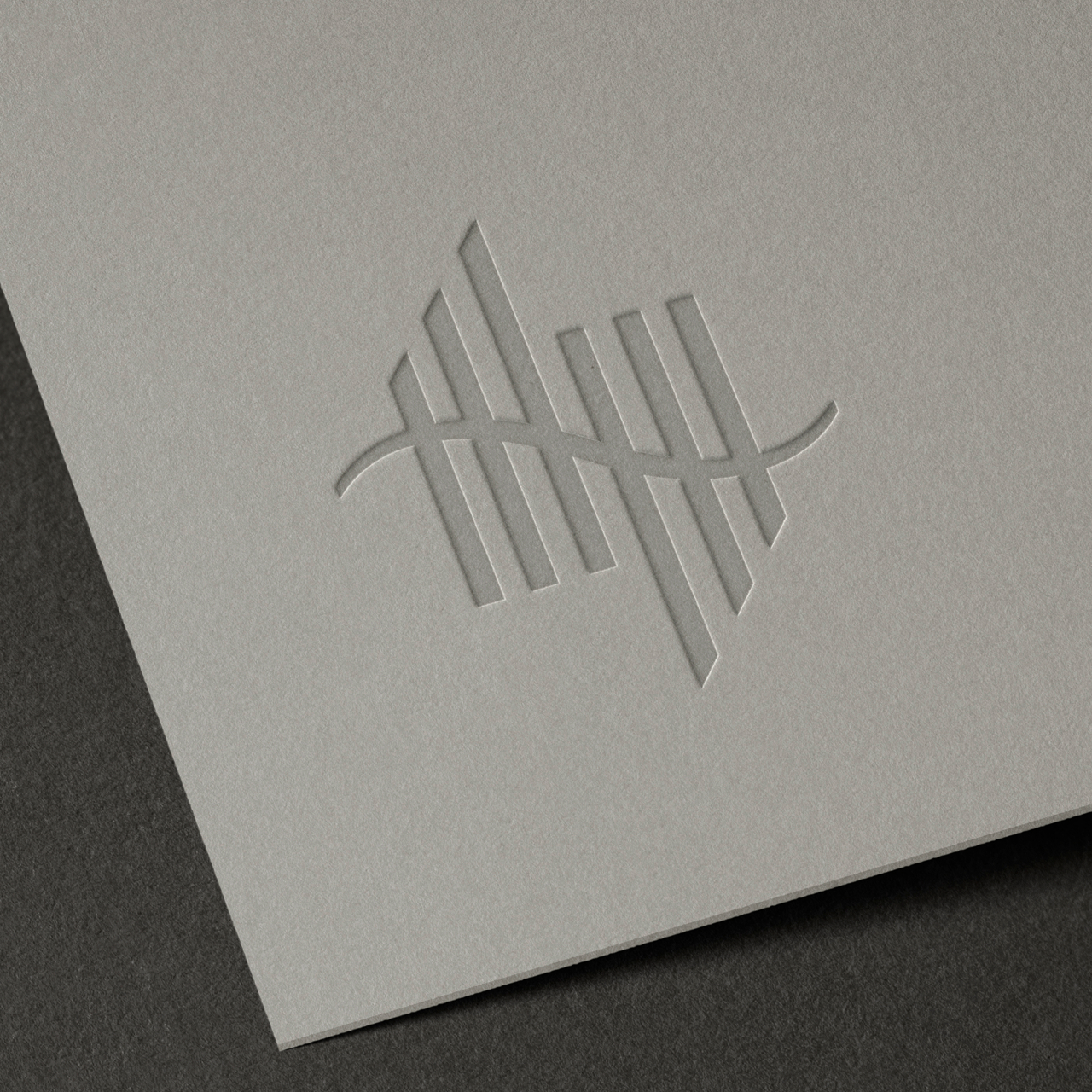
A mark of quality and excellence, the Hang Lung logo carries credible brand equity across Hong Kong and Mainland China. JWDK executed adjustments to improve its legibility and revised the logo sets to offer a stronger relationship to the Hang Lung slogan and anniversary marks.
Brand colours
Life is full of colour. It captures passion, sparks emotion and connects people. Hang Lung’s expanded brand colour palette—comprising primary, secondary and logo colours—creates an elegant, sophisticated and quietly luxurious feel, while expressing the human warmth of the company amid transformation and balance.
Brand imagery
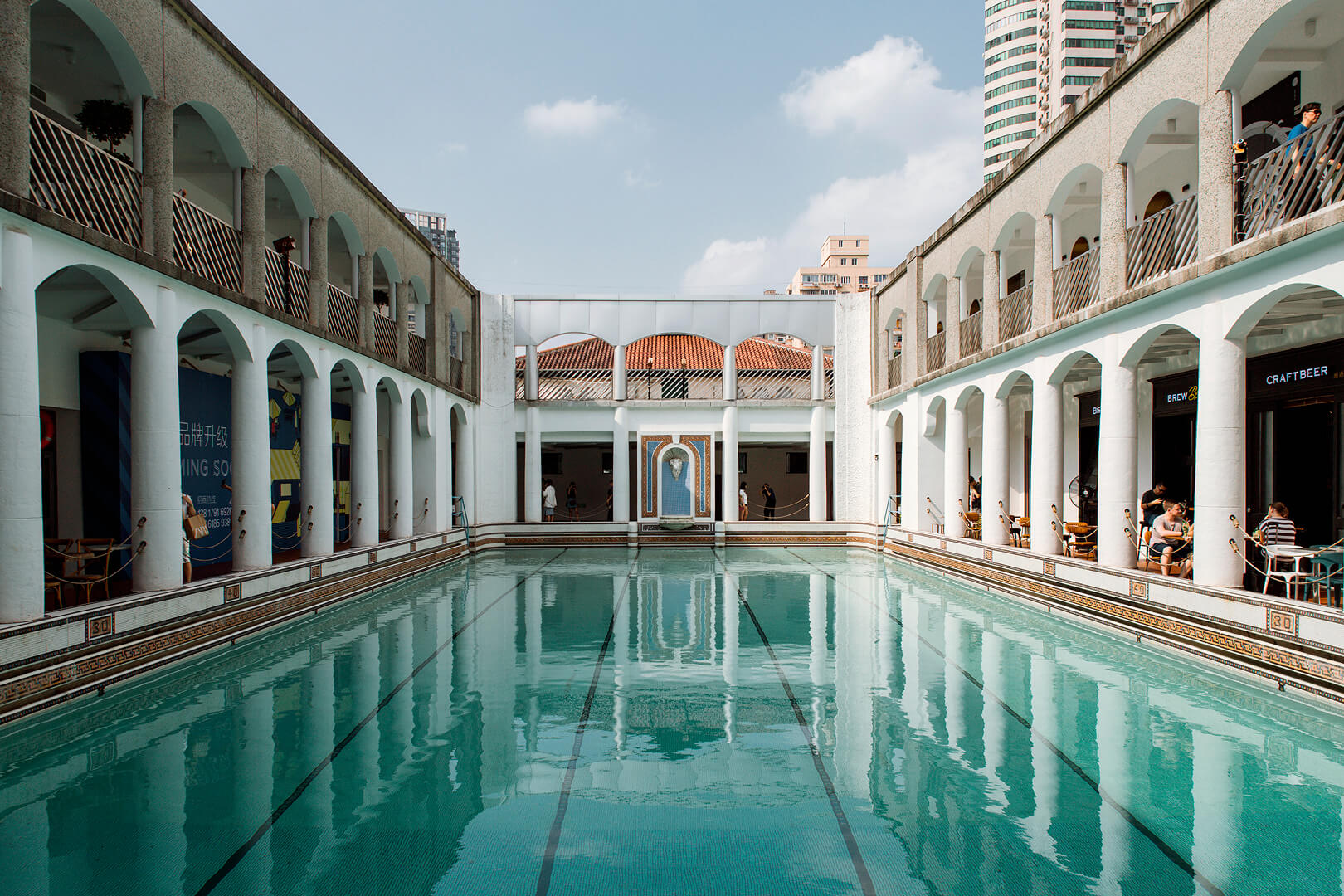
Brand photography style is natural, pure and human revealing the bold individuality of the brand’s communities whether in premium retail, office or hotels. Scenes of architecture, nature and material textures echo the brand’s commitment to sustainability, local culture and the environment. The brand imagery tells stories of time and craftsmanship, reflecting a lifestyle that blends cultural heritage with contemporary taste.
Patterns of foundation
The bespoke patterns created for Hang Lung reinterpret traditional Chinese motifs into distinctive, ownable forms that echo the brand identity’s distinct characteristics. The Legacy Pattern, inspired by layered brickwork; the Windows Pattern, drawn from the rhythmic geometry of Chinese architectural lattices; and the Weave Pattern, informed by interlaced, flexible lines. Together, these patterns express Hang Lung’s design philosophy—bridging tradition and modernity with clarity and purpose.
Dynamic line
The dynamic 45º diagonal line, inspired by the logo symbol, serves as a connection line throughout the visual identity system. It conveys upward progress, a bridge between the present and the future, and the energy of innovation.
66 years of enriching lives for today, tomorrow and beyond
As Hang Lung enters its 66th year, the milestone marks both where it began and where it is going next. More than a number, “66” has become part of the brand’s identity, shaped by its legacy and its presence across China.
To honour its enduring legacy and the journey ahead, Hang Lung has introduced its “66 and beyond” anniversary theme and commemorative logo. Evolving from the six foundational pillars of the Hang Lung emblem, the design transforms the visual language into a unique symbol of the “66” mark.
Building on a strong foundation, Hang Lung will continue creating places that enrich everyday life—today, tomorrow and for the future.
V.3 Strategy Accelerates with Landmark Projects in Shanghai and Wuxi
66 years and beyond: Enriching lives for today, tomorrow, and generations to come
Hang Lung 65th Anniversary: Celebrating a Remarkable Journey of Excellence