项目 MOHO BY HOPSON
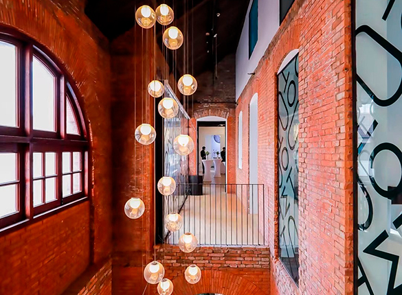
Property giant, Hopson, commissioned JWDK to develop a strategic place brand and name for its first premium mixed-use project. Built in the heart of Jing’an, one of Shanghai’s most historic and up and coming districts, the development will be home to prestigious contemporary retail and Grade-A office space that will host a vibrant cultural programme.
JWDK’s challenge was to understand the brand desires of Hopson’s target audience — Shanghai’s young, educated, socially and creatively aware consumers. The VI and name had to express elegance and reflect Hopson’s vision of the project.
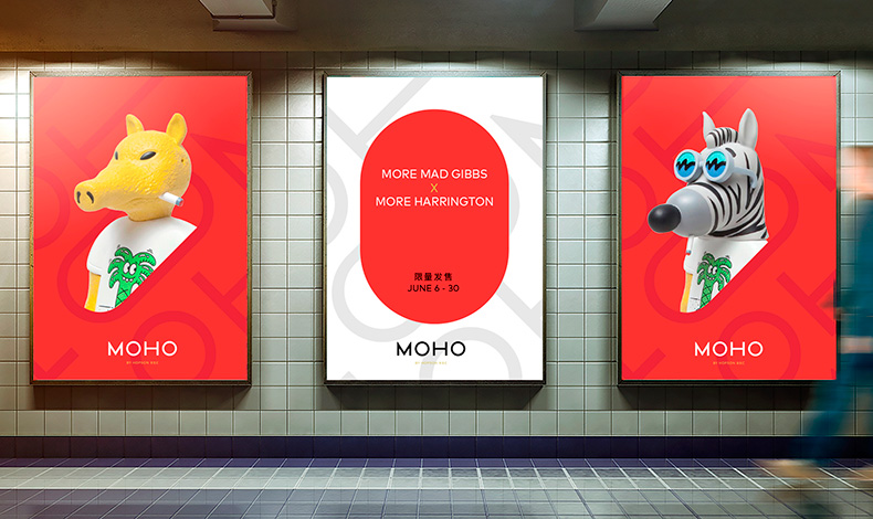
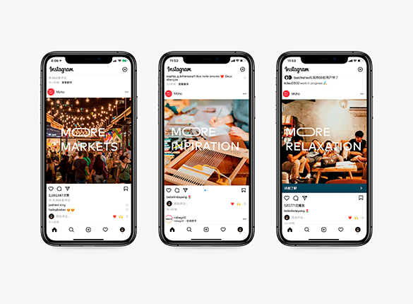
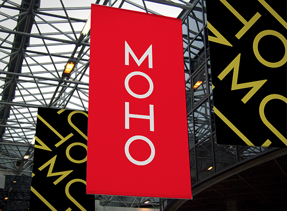
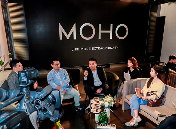
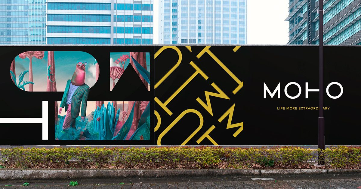
The name MOHO is an abridged expressions of “More Hopson” which prominently retains the developer’s DNA. The slogan “Life More Extraordinary” was also created to express MOHO’s brand philosophy and stimulate the consumer’s imagination with art, style and entertainment.
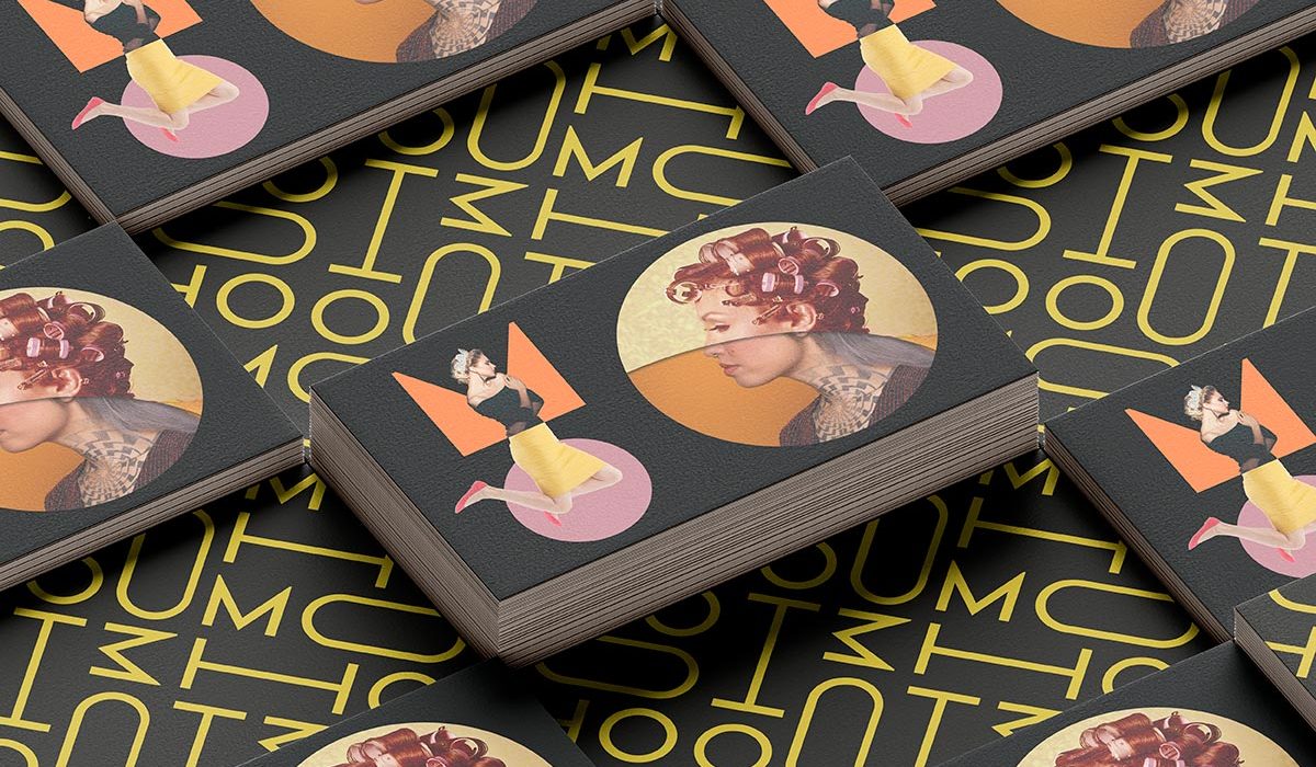
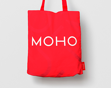
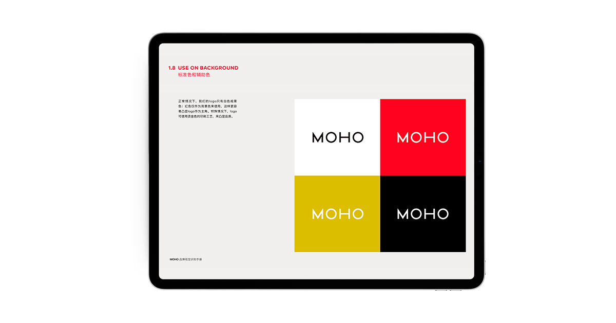
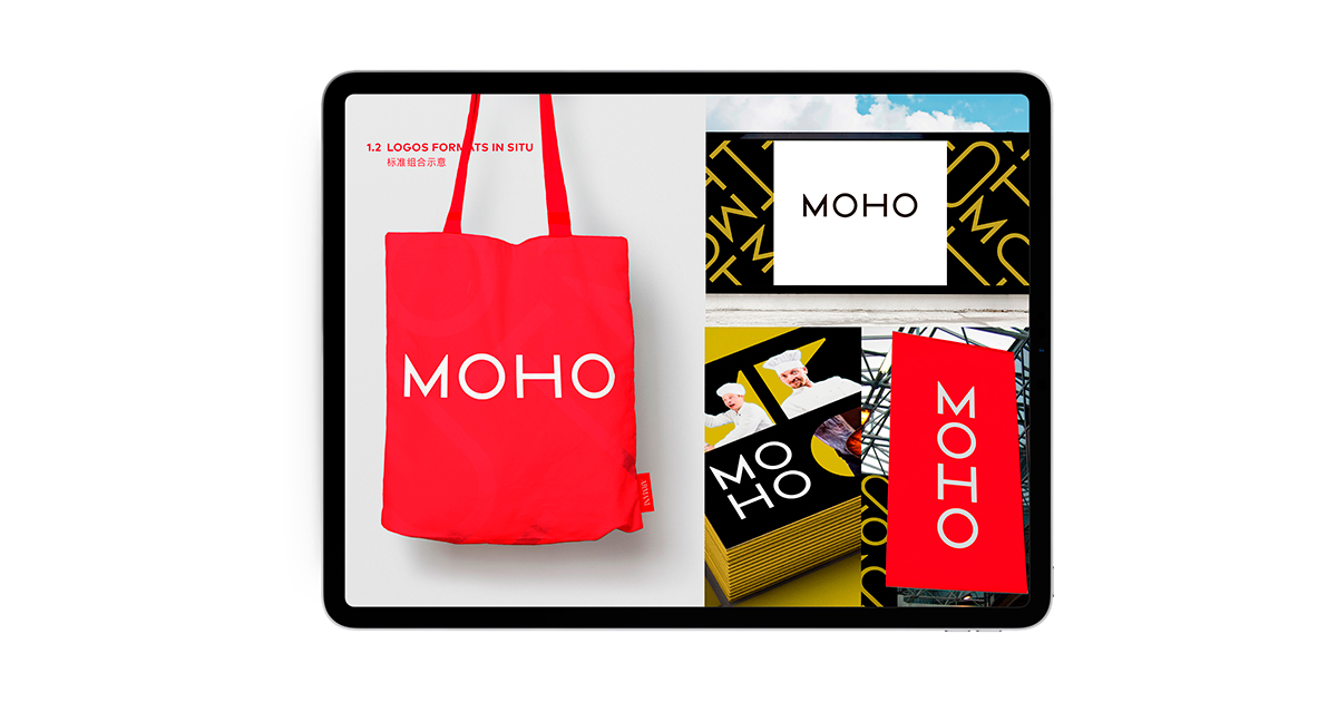
The logotype ‘MOHO’ is simple and elegant revealing the confidence of the project. The letters can be reshuffled and re-stacked adding an element of fun and dynamism and extending the possibilities of application.
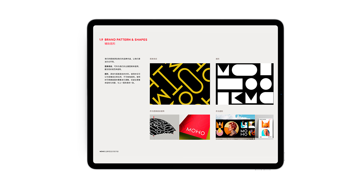
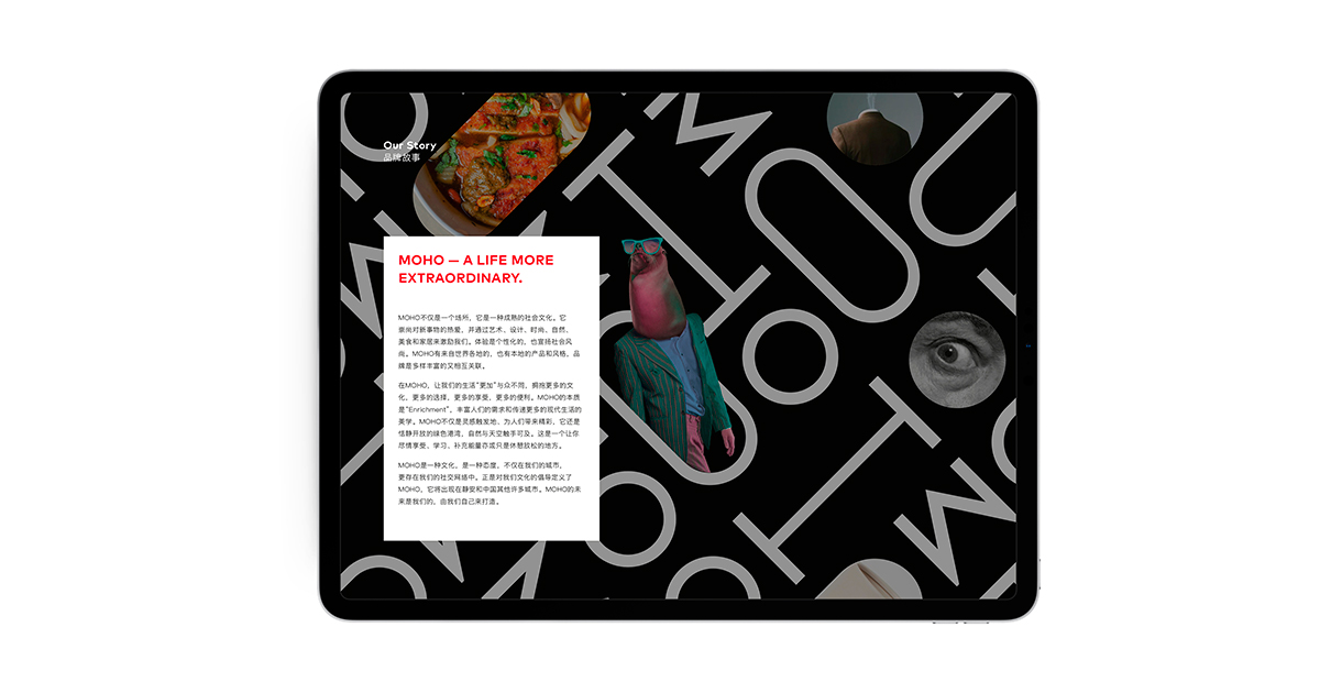
With a simple logotype, photography is the main vehicle of expression for the MOHO brand. The patterns and shapes house curated images to enhance the brand essence of ‘More Richness.’ The images chosen are intriguing iterations of art, culture, fashion and food — all of which can be found at MOHO.
MOHO (by Hopson) opens in late 2021.